Old Nikkei 225 Chart Pattern Has Story To Tell For Today
Free Chart In Focus email
Delivered to you every week
Looking at chart pattern comparisons, or "analogs", is a favorite pastime among technical analysts. It was widely engaged in during late 1987 and early 1988, after many people noticed that the crash of 1987 looked an awful lot like 1929. The conclusion then was that because of that chart similarity, the market in 1988-90 was in for a repeat of the awful bear market of 1930-32. Now we know that it turned out differently.
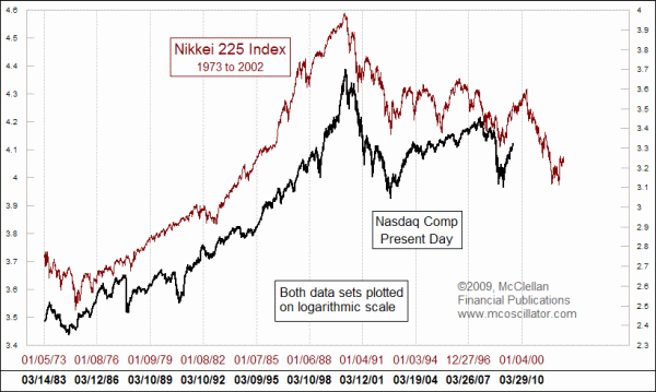
One of the great analogs still being watched these days is a comparison of the US stock market of the 1990s and 2000s to what Japan's Nikkei 225 Index did 10 years prior. The chart above looks at a really long term comparison of the two, and the resemblance is quite compelling. The amount of time from the Nasdaq's March 2000 top to the 2002 and 2009 bottoms matches up really nicely with a similar set of down waves years earlier in the Japanese market. There is even some good correlation of the more minor up and down patterns along the way.
When we look closer at the past decade, however, we can see why taking these pattern analogs seriously all the time can get one into trouble. 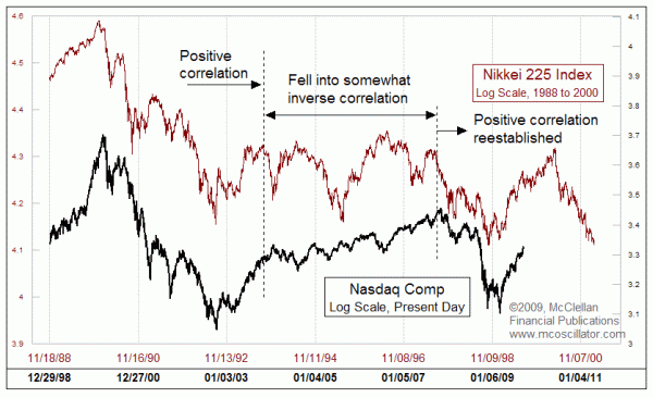
The correlation from the top in 2000 to the bottom in 2002 was nearly perfect. But from late 2003 to the top in October 2007, the relationship flipped from a positive one to an inverse correlation. The Nasdaq would top when the Nikkei's pattern showed a bottom, and vice versa. After 2007, it flipped back again to a wonderful positive correlation where it remains to this day.
The fact that there can be any resemblance at all between seemingly random price movements occurring 10 years apart is something wondrous to behold. The stock market indeed has a strange and wonderful set of rules of physics for how it operates, and what makes it move. It is even more wonderful when we can observe these things, and figure out ways to profit from them.
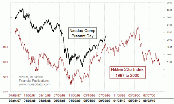 This final chart looks at the same relationship, but zooms in closer to take a look at the more recent behavior. Once again, the correlation is not perfect, it's just really really good.
If the strong positive correlation between these two continues into the future, then we are poised to see a meaningful correction this autumn before prices turn up to a higher high in 2010. After that high could come some big problems for the current stock market, but that is a long way away from now.
The troubling aspect of this relationship, and the big reason for urging caution in its use, stems from the fact that the big inversion mentioned above could occur again at any time. Any relationship that is flaky enough to invert without warning is something that is undeserving of our complete trust. We can still watch it, however, and use its message for planning purposes. As we do that, we must not take its forecast too literally, and we also must continually seek out confirming evidence to tell us that the market is still on schedule, or that it has changed to some other program entirely.
Eventually, all pattern analogs break up and stop working. This one has lasted longer than most, and is still fun to watch, although the fact that we have already seen one major inversion is a sign that the eventual breakup is getting closer. Be cautious not to focus on it too closely, and lose sight of other important evidence of what the market is doing.
Tom McClellan
Editor, The McClellan Market Report
Sep 11, 2009 Is a Higher Savings Rate a GOOD Thing? |
Jul 17, 2009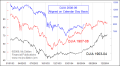 Panics We Have Seen Before |