The Volatility of Volatility
Free Chart In Focus email
Delivered to you every week
The CBOE Volatility Index (VIX) is one of the favorite tools of technical analysts. It measures the "implied volatility" that is priced into SP500 options. Put simply, implied volatility means how much extra premium is priced into the cost of an option, over and above that option's inherent value plus the time value of money. As such, it reflects a sort of "insurance" cost. In the same way that earthquake insurance typically costs more in California than in Nebraska, volatility insurance in the stock market tends to cost more during wild price movements than during periods of calm.
The numerical value of the VIX itself can be a useful sentiment indicator, especially when compared to recent values. Comparatively high VIX readings are reliably associated with important bottoms for stock prices, because those high VIX values say that fear is at a maximum. Very low VIX readings show complacency, which can be indicative of a price top for stocks. In every issue of our twice monthly newsletter, we show the VIX compared to its 50-day moving average, with 1-sigma Bollinger Bands to help gauge where "high" and "low" levels are.
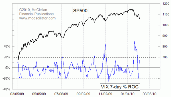
In addition to the raw VIX level, we can also gain interesting information about the market by observing the way that the VIX moves around. This week's chart looks at a very simple indicator used on the VIX, the percent rate of change (%ROC). It simply measures how far the VIX has moved from the value 7 trading days ago. The VIX will understandably move up and down as prices change, but sometimes the movements of the VIX can be extreme. Saying it another way, sometimes options traders overshoot in their short term adjustments to options pricing.
For the 7-day %ROC indicator, readings outside +/-20% tend to be useful signals of a change in direction for stock prices. A big move in the VIX is a rapid shift in the sentiment of options traders. Such signals do not always work as price reversals; at the beginning of a strong uptrend especially, there can be false signals (as with most indicators).
During the late January stock market selloff, the VIX rose sharply, resulting in a high reading of +49% for the VIX's 7-day %ROC. That reading said that traders were overreacting to the selloff, and the market bounced up a little bit. But on that upward bounce, the %ROC indicator dropped all the way to -21%, which said that options traders were overreacting with optimism about the bounce.
Another way to examine the movements of the VIX is using an indicator called Average True Range (ATR). This study is often used with stock prices, to measure the volatility of prices themselves. Using it with the VIX is a way of measuring the volatility of traders' perceptions about volatility.
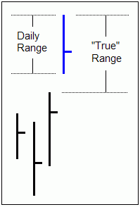
"True" range differs from the daily high-low range in that it incorporates the effects of gaps in prices, as shown in the diagram. For use as an indicator, the daily value for true range is usually smoothed in some way, to reflect what the average trend has been recently, and to filter out large or small individual days.
The chart below shows a 21-day ATR for the VIX, meaning that it is a 21-day simple moving average (SMA) of the daily true range for the VIX. It turns out to be a nice indicator to use with stock prices, especially when it initiates a change in behavior. 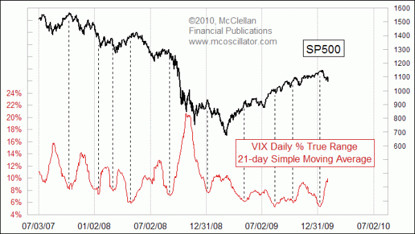
At the SP500 price top on Jan. 19, the VIX 21ATR was just starting to turn upward from a multi-month low. With the recent stock price decline, the VIX 21ATR has now jumped up to its highest reading since the March 2009 stock market bottom. That does not guarantee us that a bottom is in, but the high level does say that the VIX has already made a dramatic reaction to the price changes, and it suggests that a bottom is near.
Tom McClellan
Editor, The McClellan Market Report
Oct 09, 2009 VIX Headed Much Lower in 2010 |