VIX Headed Much Lower in 2010
Free Chart In Focus email
Delivered to you every week
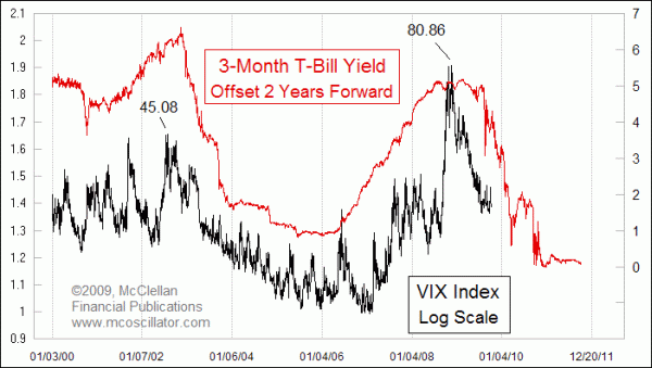
During the worst of the financial crisis in 2008, the VIX climbed up to a closing high value of 80.86 on Nov. 20, 2008. That is not the highest it has ever been, though.
The old VIX, which was based on SP100 (OEX) options, hit a closing high of 150.19 on Oct. 19, 1987, and it even went up to 172 intraday on Oct. 20, or so it is believed. The quote mechanism back then had trouble keeping up with trading in real time during the 1987 crash, so we cannot ever be sure of exactly what happened when. A reading of 80 for the new VIX (based on SP500 options) is still really high, and VIX values have been working their way back downward since that 2008 high. Current readings are in the low 20s, which seems like a big decline in less than a year, but readings in the 20s at one time were considered high. So where is the VIX going from here?
For insight, this week's chart shows the leading indication for the VIX that is given by short term interest rates. The yield on 3-month T-Bills is pushed forward by 2 years in this chart to show how its movements lead to similar movements in the VIX after that lag period. T-Bills are not a perfect predictor of what the VIX will do. The VIX is clearly a lot noisier than interest rates are. The amazing thing is that anything which happened 2 years ago might have something meaningful at all to say about something happening now. The reason why this works is that the VIX is tied to actual volatility in the market, and volatility is a symptom of illiquidity. By that, I mean that when liquidity is poor, prices have to travel farther to hunt for available pockets of liquidity. When there is plenty of money around, prices tend to calm down. Lowering interest rates eventually leads to that greater liquidity, but with a lag. It takes a while for the effect of those lowered rates to flow through to the behavior of stock prices.
Right now, we are in the period that is 2 years after the most rapid part of the drop in interest rates, so we should expect that the VIX will continue to move to lower values into early 2010. Later in 2010 and into 2011, we should see the VIX begin to stabilize at lower values, much like it did in 2004-05. That earlier period was the echo of the Fed's rate cutting efforts in 2002-03. Once the Fed starts raising short term rates again, we should see the VIX start heading upward again about 2 years after that rate increase starts.
So what does that mean for stock prices? A falling VIX is generally associated with rising stock prices. The same stronger liquidity which dampens down volatility also helps to push stock prices up. The ascent in stock prices becomes more gradual as volatility lessens, so we are not likely to see the same sort of upward slope that we saw coming out of the March 2009 bottom.
Readers are reminded not to interpret this road map for the VIX too literally; it is a general guide for where the VIX is going to go, and does not lend itself to the degree of precision we might like if trying to trade based upon it. But it is nevertheless helpful for us to know what the "new normal" will be like for the future range of VIX values.
Tom McClellan
Editor, The McClellan Market Report
Feb 05, 2010 The Volatility of Volatility |