A-D Line Divergence Shows Bull Market Starting To Crack
Free Chart In Focus email
Delivered to you every week
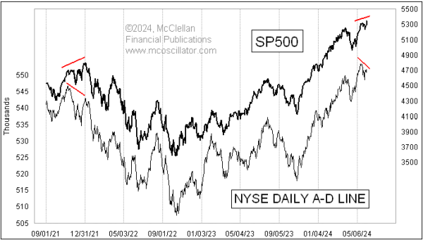
The SP500 is up to a new all-time high, but the NYSE's Advance-Decline (A-D) Line is not confirming that. This is a sign of trouble, because it means that the concentration of buying in certain big cap stocks which drive the major averages is not being confirmed by what the rest of the market is doing.
A cumulative daily A-D Line is calculated by tabulating the number of stocks going up every day (Advances) and subtracting the ones who close down (Declines). That daily A-D difference is known as "the daily breadth". An A-D Line is a running tabulation of all prior data, and it changes each day by the value of the daily breadth number.
Most of the time, the NYSE's A-D Line will echo what prices are doing. That is the normal behavior. But I watch the NYSE's A-D Line carefully all the time, because historically a bearish divergence like what we are seeing now has been a big sign of trouble. Most price indices are dominated by the largest capitalization stocks, but every stock gets an equal vote in the A-D Line.
That can be useful because when liquidity starts to dry up, it typically affects the smaller capitalization stocks first. That poor liquidity eventually comes around to bite the big stocks. So the A-D Line functions like the canaries in the coal mines of Newcastle 200 years ago, being more sensitive to the bad gases, and providing an early warning of impending problems for the coal miners.
A-D Line studies can also be useful because it is hard to manipulate those data. While it may be possible for big traders to manipulate a single stock, or perhaps even the big stocks which move the major averages, it is functionally impossible to manipulate all of the stocks (unless you are the Fed, doing quantitative easing).
I prefer the NYSE's A-D Line because it has a much better track record of working. The Nasdaq's A-D Line, by contrast, is a horrible indicator because of its persistent bearish bias.
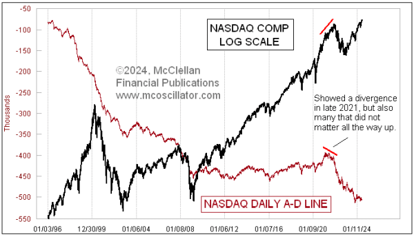
The listing standards for stocks are looser on the Nasdaq than on the NYSE. So a stock which is going to go from IPO to broke is more likely to be listed on the Nasdaq. And every day that its share price spends on the way from the IPO price to zero, that stock is contributing to the Declines column of the data. The Nasdaq Composite Index is currently making new all-time highs, but its A-D Line is near its all-time low readings. This is not unusual.
When doing presentations, I like to stump the audience by asking when was the last time that the Nasdaq's A-D Line made a new all-time high. This is a trick question, because it has never made a new all-time high. It started downward from the beginning of the data in 1972, and has never gotten back to that level.
There is a little bit of value in looking at the components of the Nasdaq 100 Index (NDX). Back in 1999 I figured that those A-D data might be interesting to look at, but I could not find it published anywhere. So I compiled the data to calculate those breadth statistics myself. The hardest part was tracking the component changes over time, which the Nasdaq did not completely publish as far back as I wanted to go. And now I have to keep track of component changes as they happen annually, and also sometimes in the middle of a year thanks to mergers or delistings.
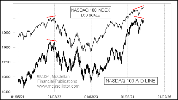
Right now, we are seeing a bearish divergence from prices in the A-D Line for Nasdaq 100 stocks. This is a pretty rare event, because it almost never shows a bearish divergence. I have good A-D data back to 1993, and I think this is just the 5th time we have ever seen a bearish divergence like this. Most of the time it just does what the NDX does. The other times were in 2021, shown in the chart, plus back in 2000, 2007, and again in 2015. All were good indications of trouble coming.
Any divergence represents a "condition", and is not a "signal". Divergences are funny because they do not necessarily have to matter right away, just because we may notice them. Divergences can also sometimes get "rehabilitated". If these A-D Lines start moving up and making higher highs again, then the apparent divergences we see now go away. That is a possibility.
Divergences also will not tell us how big such problems might be, i.e. how bad any price decline might be. For now, though, these are warnings of illiquidity problems for the stock market.
Tom McClellan
Editor, The McClellan Market Report
Feb 01, 2024
HY Bond A-D Line Rehabilitates a Divergence |
Aug 27, 2021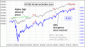
A-D Line’s Troubling Divergence |
Nov 27, 2019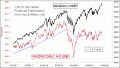
Nasdaq A-D Line Lagging, Does Not Matter |