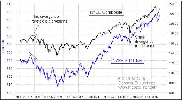
NYSE’s A-D Line Almost to New All-Time High
Free Chart In Focus email
Delivered to you every week
On April 15, the SP500 and the Nasdaq Composite Index moved to new all-time highs, and added to those records on April 16. The NYSE's A-D Line is still 1018 net advances away from equaling its own all-time high.
Some might see it as a bearish divergence to have the SP500 make a new all-time high while the A-D Line has not yet confirmed. I do not see it that way, in part because the NYSE Composite Index is still 2.4% away from its own all-time high. So in that sense, the A-D Line is actually doing better than prices. It is just that the SP500 is doing even better than that.
And it is further worth noting that the NYSE breadth data have been averaging 738 net advances in the two weeks since the March 30 price low. It is really hard to criticize that as being not strong enough. It is a very steep rise in the A-D Line, which conveys the statement that liquidity is plentiful.
Divergences between the A-D Line and prices are a big deal for me. And I should emphasize that bearish divergences are much more valid and important than bullish ones. Sometimes the A-D Line can lag just a bit at turning up from an oversold bottom.
The fun thing about the A-D Line is that every stock gets an equal vote. Some see this as a flaw, asserting that tiny little companies which do not matter much should not get the same vote as big stocks which drive the cap-weighted indices. But this supposed flaw is actually a strength.
When liquidity starts to dry up, it hits the most vulnerable stocks first. So if one looks only at the healthiest of stocks, one can miss the message that liquidity is starting to be a problem. This is why I do not pay much attention to the A-D Line for the stocks which make up the SP500. Those stocks are all on the varsity team, and they are not as vulnerable to liquidity problems as the more marginal companies' stocks.
I have also found that the NYSE's A-D Line works better at giving these messages than other A-D data. The Nasdaq's A-D Line, for example, has a profound bearish bias, and always has. It has never made a new high in its entire history. It started going downward from the beginning of the data in 1972, and has kept going down. This is because the Nasdaq exchange has looser listing standards, and so a company that is going to IPO then go broke is more likely to do that on the Nasdaq. And every day it spends declining from its IPO price to zero will contribute to the Declines column.
I also find that the daily A-D Line for high yield corporate bonds can serve as an excellent indication of liquidity problems, or lack of problems. Those corporate bonds are marginal investments, and they draw from the same pool of liquidity that the stock market does. So when the HY A-D Line starts diverging, it is a great warning of trouble. Right now, there is no sign of that trouble from that indicator.
I feature the NYSE's A-D Line in every issue of our twice monthly McClellan Market Report. And I show the HY Bond A-D Line periodically there and in my Daily Edition when it has something useful to say. If it as been a while since you were a subscriber, or if you are curious about learning more, check out our web site, www.mcoscillator.com.
Tom McClellan
Editor, The McClellan Market Report
Jan 15, 2026
A-D Line New High Limits Drawdowns |
Nov 27, 2019
Nasdaq A-D Line Lagging, Does Not Matter |
Feb 01, 2024
HY Bond A-D Line Rehabilitates a Divergence |